Default widgets - hamonise their appearance
- /e/ version:
- Device model(s):
- Device rooted: no
Summary
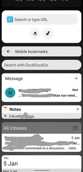
The screenshot below shows different default widgets from /e/:
- 3x Browser
- 1x Message/SMS
- 1x Notes
- 1x Mail
- 1x Calendar
The collection of default widget does not appear very harmonic it terms of colors, text/title size, shape of the rounded corners.
There's the question as well if they all should be with a white/grey background or rather trans-lucid as the preinstalled ones.
It would be nice to have them all (including the preinstalled ones) following the same design language - ideally one that is easy to adapt for 3rd party apps to follow (in case there's an interest in the future).