Harmonize usability of 'Message', 'Mail' and other default apps
- /e/ version: 1.4 and others
- Device model(s): any
- Device rooted: no
Summary
The apps that come with /e/OS as default have their origins in other open source projects. Boxed within /e/, ideally they should look and feel in a similar manner. Whereas the 'look' (color codes) has been harmonised, in terms of usability (the 'feel' side) there are still huge differences.
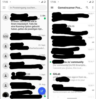
As an example I would just like to use the Mail (K9) and Message (Qsms) apps.Both apps had a similar aim - displaying messages, let the user read, reply and create new messages.
Major differences:
- Green dot for indicating unread messages: Message: right side of the message. Mail: Left side of the message
- Pic or shortcut of the senders name: Message: applied, left if the message. Mail: not applied
- Creating a new message: Message: Material Design button bottom right, Mail: hidden in the 3-dot-menu
- Getting rid of the message: Message: long-pressing the message, then the trash button for deletion or a swipe to archive it. Mail: Message: long-pressing the message, then the trash button for deletion, but no swipe-to-archive function. (issues for default settings for swipe actions in Mail and in Message)
- Search: Message: Central top space of the app, Mail: Lens-button then searching
- Hamburger menus look different in both apps
- Additional 3-dots menu: Message: not existing, Mail: existing, top right
Here is would be desirable to harmonise both apps (and subsequently other default apps)
Edited by Aude M